Westfield US App Refresh

Background
Westfield is an international retail corporation with a chain of malls and shopping centers all across the US. Their Westfield US app is used to find and navigate Westfield malls, and contains informations about stores, hours, locations, and store deals.
The Problem: The current app interface is overcrowded, with an outdated aesthetic and functional issues that make it seem disorganized and ineffective.
Research
I conducted a heuristics evaluation based on Nielsen's usability principles, and a usability test to identify pain points and create a user journey map.
Strengths
-
Consistent design
-
Follows real world conventions
Weaknesses
-
Lacks modern and aesthetic design
-
Does not update user of system status
-
Does not allow user to recognize and recover from errors
User Journey Map

Pain Points
-
Functionality issues: search function doesn't work consistently and often causes the whole app to crash
-
Feedback: only provided user with an error number without an explanation or solution, and no feedback on what exactly was going wrong
-
Map design: the interactive map has a busy and inconsistent interface, with text labels of different sizes and color coding with no pattern
-
Text: the lists of stores and categories are pages full of text with limited images or breaks
Design Process
These images show the starting point of the Home page, Map page, Stores page, list of stores, and Account page.


I made wireframes for the Stores page to test out how I wanted to change it. For the rest of the pages I kept the layout similar but streamlined and updated the designs.

The Final Design
-
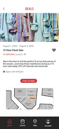
Home page: I changed the featured deals and events elements to scroll horizontally, requiring less navigation between them. The entry for each deal or event shows all the relevant information and a link to the interactive map, making it easy for the user to find.
-
Stores page: I consolidated the Stores page into a list of all the stores with the categories and alphabet being horizontal scroll bars at the top. This makes it simple for the user to sort by store category without cluttering the view like the old design.
-
Map page: I simplified the map design, removing colors for everything outside of the mall to reduce visual clutter. Each section of stores is grouped together and color coded to make navigating around the mall easier and to match the mall directory. The same store category filters and search bar can be used to identify stores.
-
Account page: I changed the background of the header to make the text clear and readable. The primary call to action button is now red to fit with the brand theme and stand out.
Stores Page and Store Entry


Home Page and Deal Page

Map Page

Account Page

Prototype
Using Figma, I made a prototype to evaluate the user flow and experience of using the new design. I made frames with overflow that scrolled and linked related pages together.
Next Steps
Future steps would involve handing off the app to developers to fix the back end issues such as the constant errors and search functionality. Further user testing is needed to evaluate the redesign of the interactive map and to ensure the primary functions of the app can be completed.